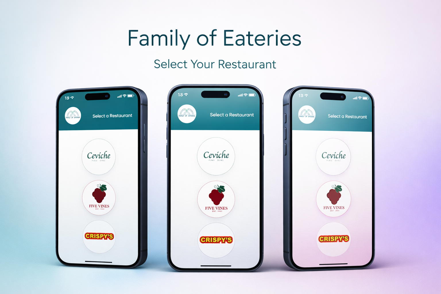
App Home Screen
Restaurant Listing
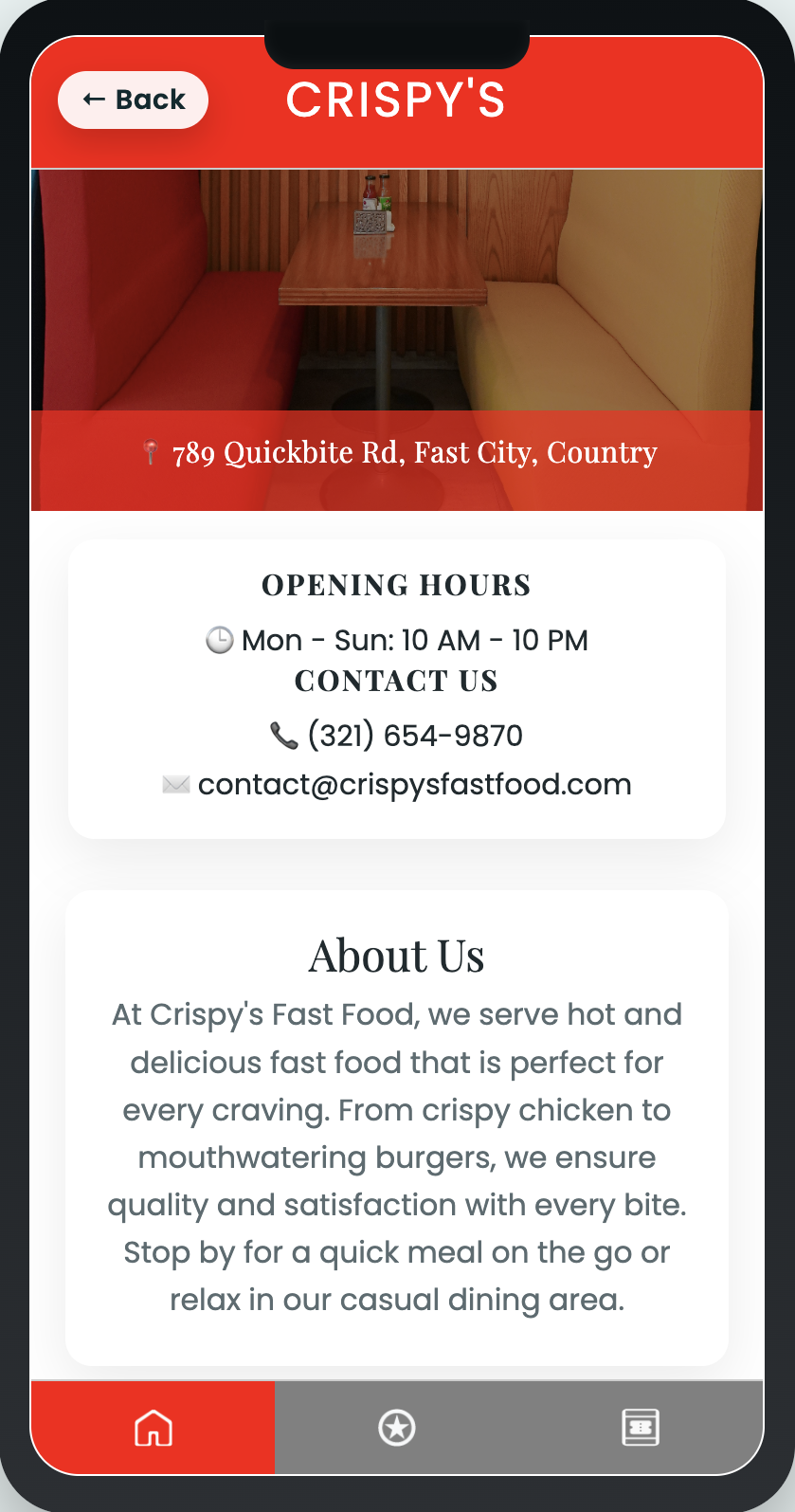
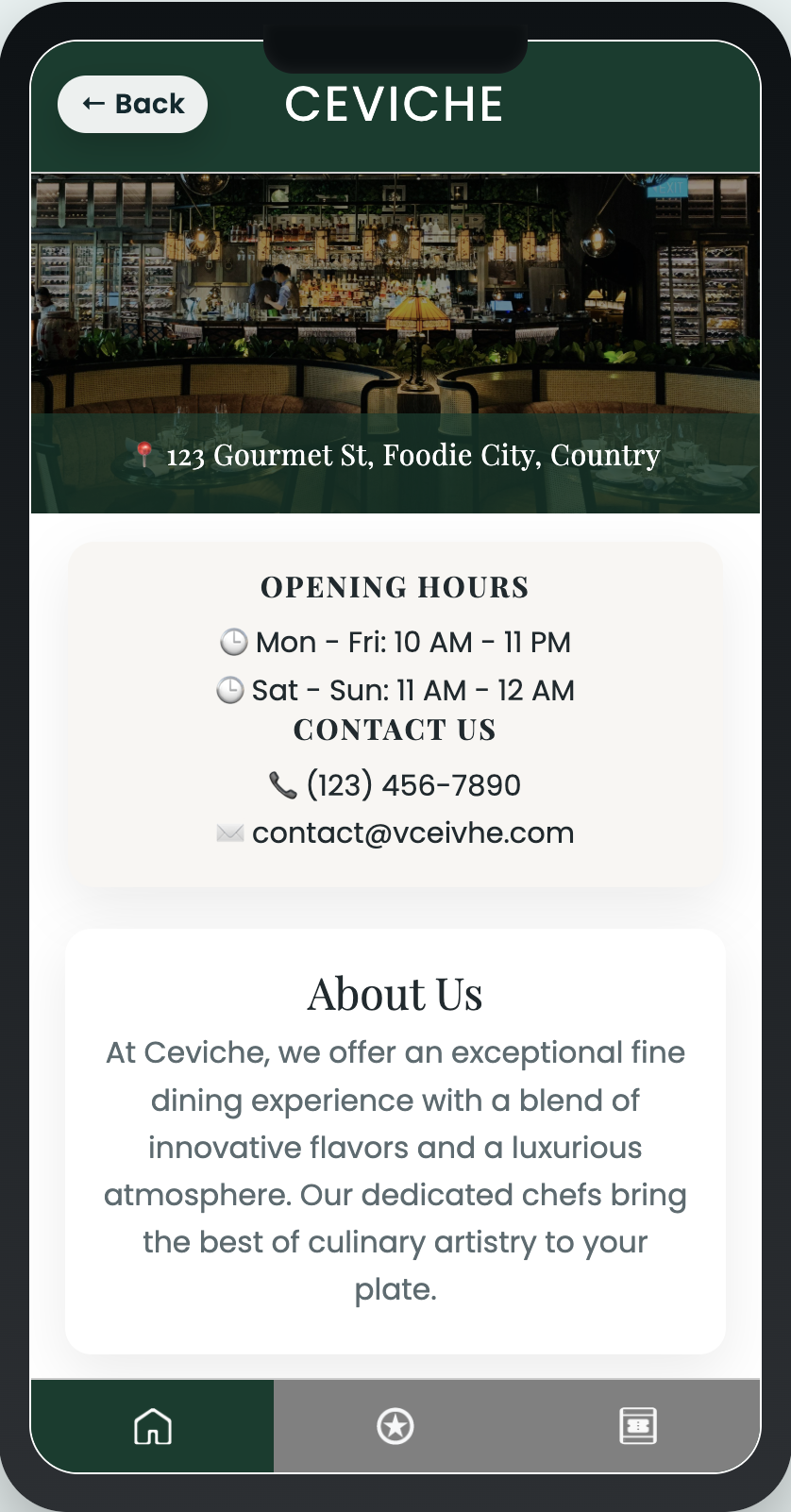
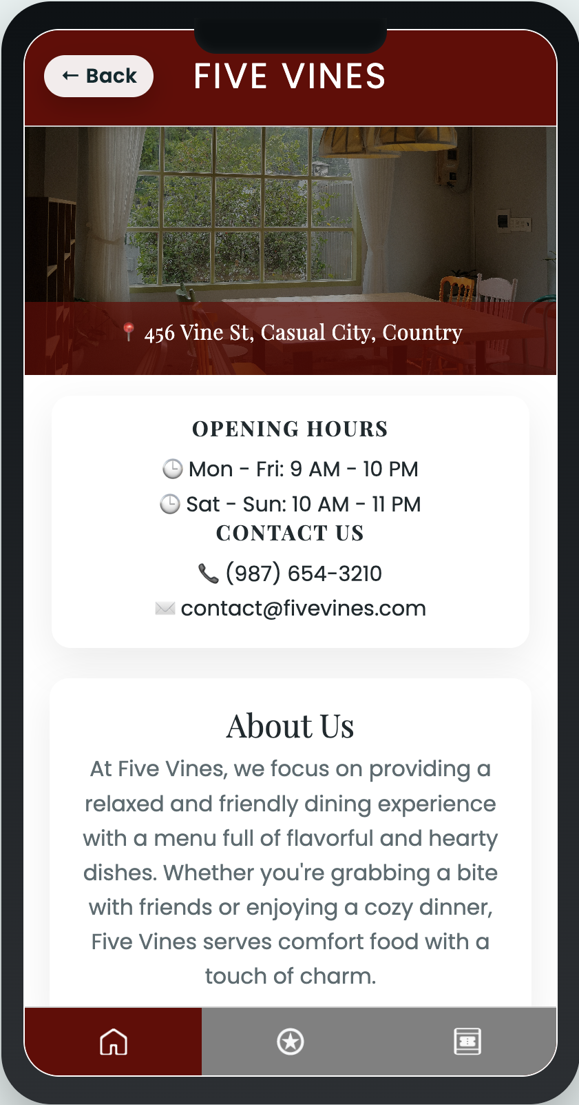
Menu Detail
Wireframe Concept
Layout Exploration
01 — Overview
0
% Hero Engagement
0
% Scroll Depth Lift
0
% CTA Click Lift
The work focused on making the brand feel bright, warm, and full of personality while keeping conversion and readability strong.
The previous pages felt generic and lacked emotional connection. We redesigned the full visual system around organic forms, lively motion, and short, high-impact storytelling blocks.
The result was a more memorable first impression with stronger brand recall and clearer storytelling across the experience.
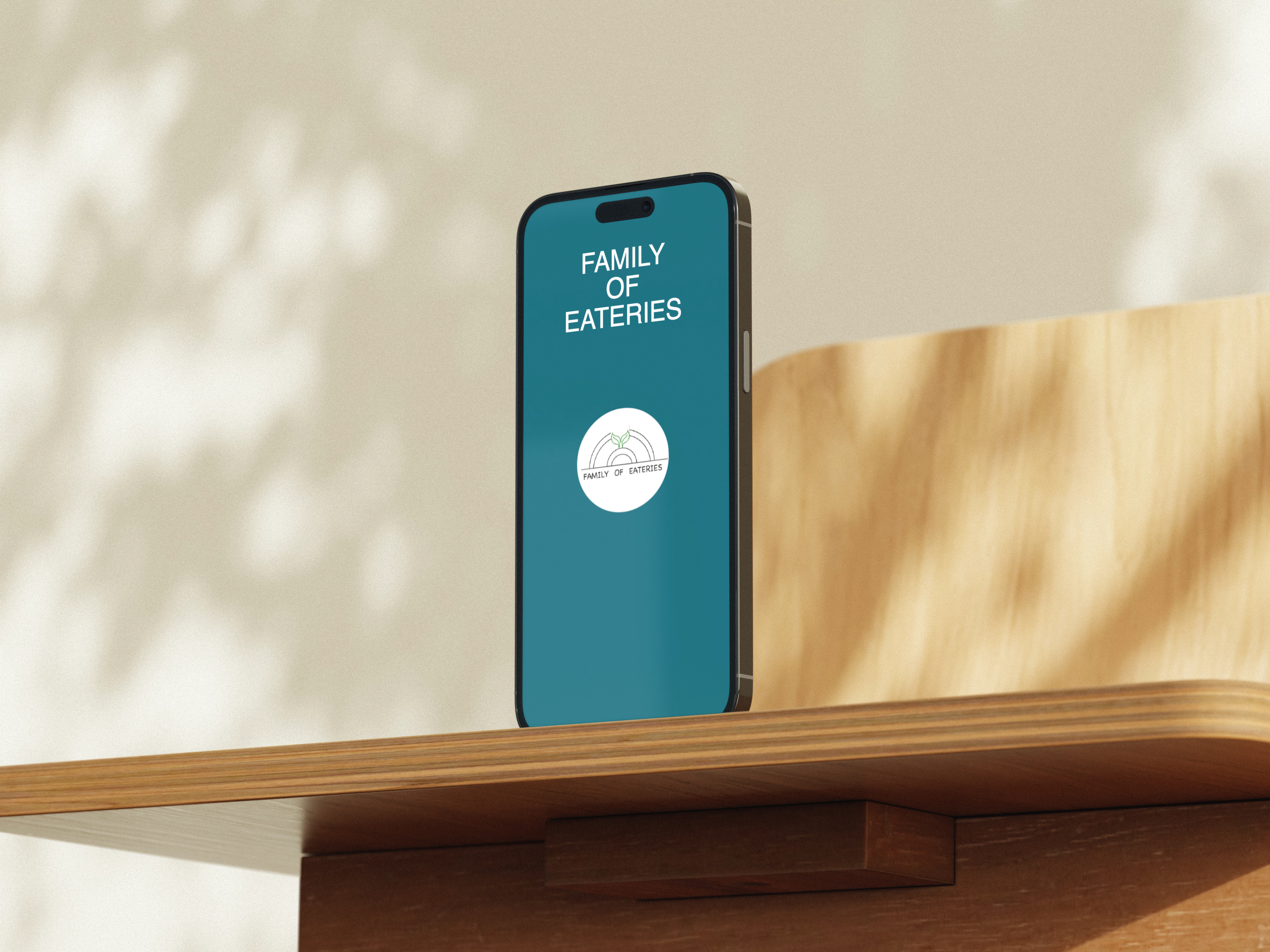
→ Process hero from the Family of Eateries case study
02 — Process
01
Audit tone, positioning, and user intent.
02
Build shape library, color blocks, and type hierarchy.
03
Layer scroll reveals and hover/parallax interactions.
04
Optimize spacing, responsiveness, and perceived performance.
The new identity feels alive. It finally reflects the warmth of our brand. — Project One Results
03 — What Was Built
A brighter, warmer visual identity built to feel full of personality without sacrificing clarity.
Short, high-impact storytelling blocks were used to make the brand feel more human and memorable.
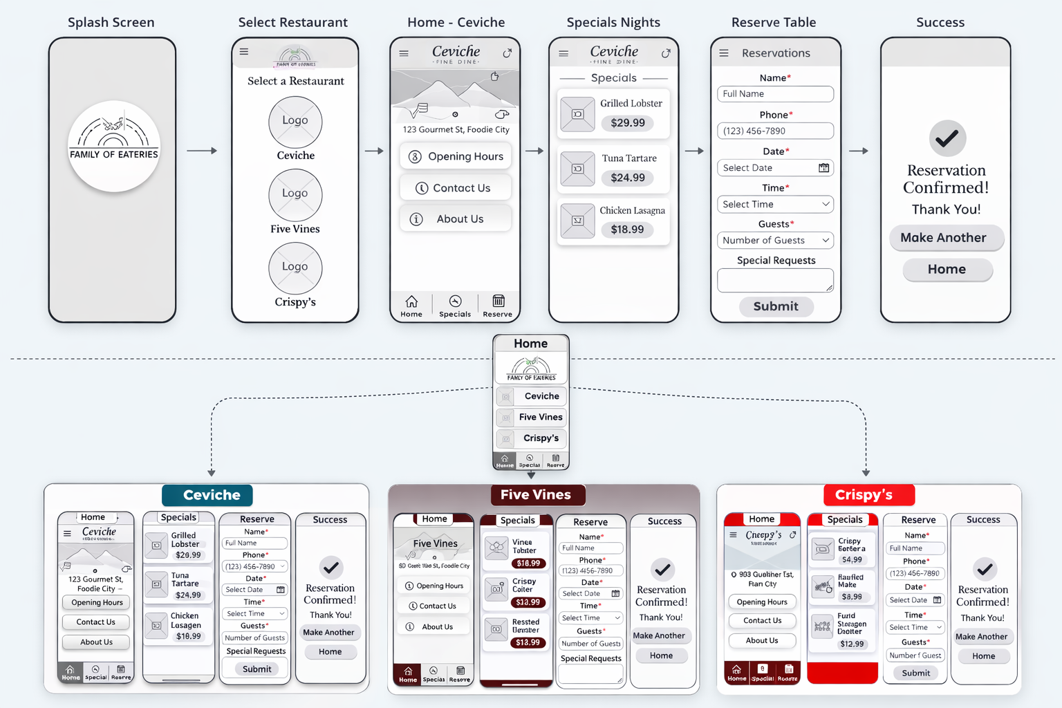
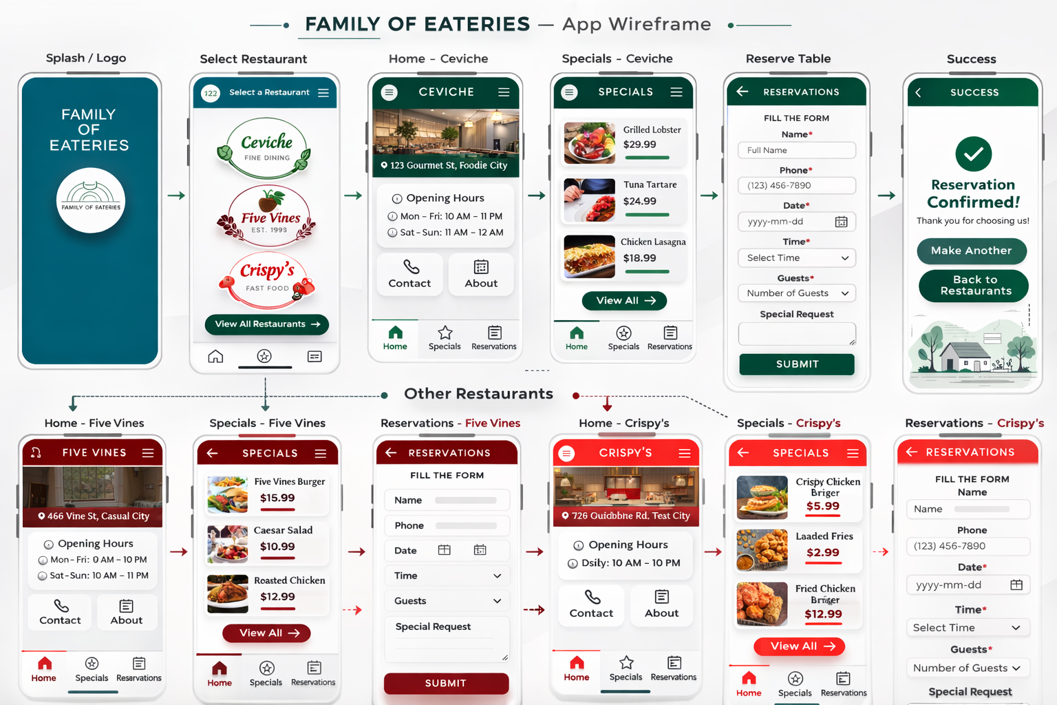
Smooth scroll reveals and layered composition guide attention block by block through the experience.
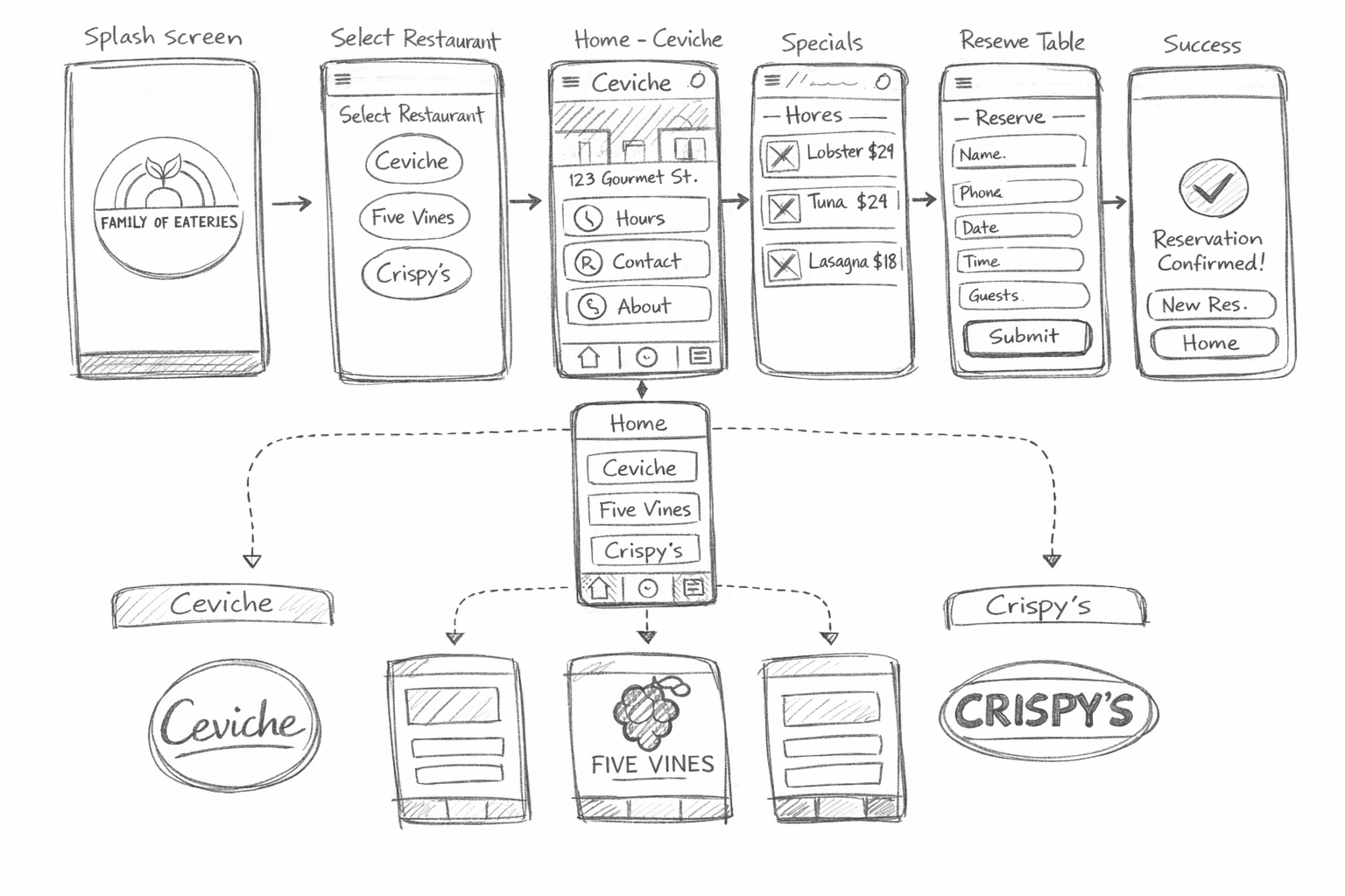
Early low-fi to high-fi layout exploration helped shape the final narrative flow and screen hierarchy.
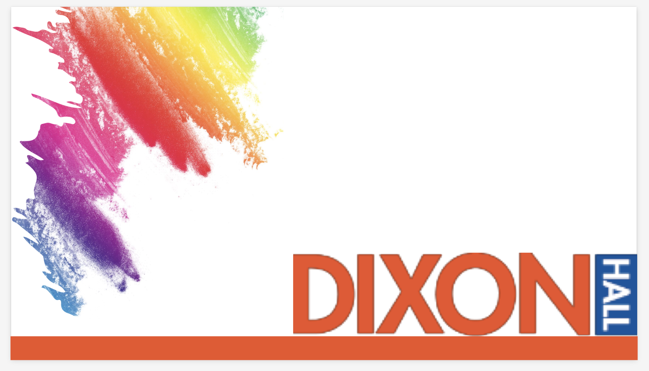
Distinct logo and palette directions were prepared for the three restaurant brands in the system.
The palette combined sunny yellow, forest green, and fruit tones to mirror the brand's energy.
— Visual Showcase
04 — Results